[ad_1]
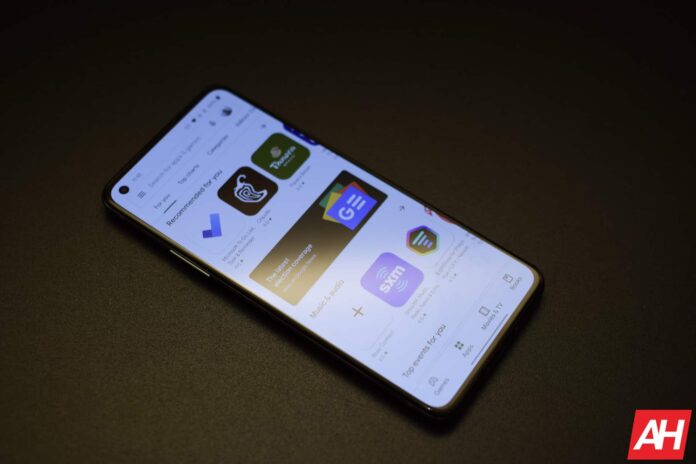
Google is now fitting app screenshots from developers on the Play Store to fit individual device screen form factors. This change will become very useful to netizens as they will have a mental picture of how the app will look on their device. Currently, to give users an idea of the app’s interface look, developers often add more than one screenshot from different screen form factors.
This means that developers might add screenshots from a regular smartphone, a tablet, a foldable device, and a Chromebook. Users will then have to swipe across the various media content on the app to find the screenshot that suits their device. Well, not all developers add these screenshots as some are more comfortable sticking to just screenshots from a smartphone.
Google is now bringing a fix to this by offering users app screenshots on the Play Store that fit their device’s screen form factor. This change is yet to arrive on all devices, but some Google Play Store users are already spotting it. In addition to this change, tablet and Chromebook users are now getting a new tab on their Google Play Store app.
Here are the changes coming to the Google Play Store for different devices
Aside from the change involving app screenshots on the Play Store, tablets and Chromebooks are also getting another change. For all devices, the app screenshots in the media section for each app on the Play Store are getting a significant change. This change will help to match the app screenshot with the device’s screen form factor.
So if you’re using a smartphone to access the Google Play Store, the app screenshots you’ll see will fit your device. If you then switch to using a tablet, for instance, the app screenshot will also fit the tablet’s screen. With this, you’ll be able to easily tell how the app will look on the device you’re using.
Google is rolling out this feature to all devices that have access to the Play Store. This ranges from large-screen devices like tablets and Chromebooks to smaller-screen devices like Wear OS watches. So, regardless of the device you’re using, you’ll be able to see what each app will look like on your screen.
The media section of each app can be accessible just under the “About this app” section of the installation page. Tablets and Chromebooks are also getting a change with the introduction of a new navigation tab. This new tab is the “New” section, and it contains everything fresh on the Play Store.
Some users already have access to these changes on their Android, Wear OS, or ChromeOS devices. Others are yet to get these changes because the update isn’t available on their device. If you fall into the second category, then you can wait for the change to become available on your device.
[ad_2]
Source link
