There’s never a dull moment with TikTok. Even if there are periods of calm, sooner or later, there is always a new conspiracy or dangerous trend that revolves around the dangerously popular social platform. So much so that state officials are politely asking Big Tech to outright ban TikTok.
The company behind the short form video platform doesn’t take this sitting down though. And while they could retaliate and fight this move, they opted for peace and transparency. The company outright invited officials to examine their business and algorithm as closely as they want to.
Now, in an attempt to prove their claim to that invitation, the company has unveiled the integration of a brand new API — Application Programming Interface, think of it as a mini-software that does a specific thing — which provides public data on accounts and content to researchers worldwide.
TikTok has over a billion downloads on GooglePlay alone.
While this includes both state researchers and nonprofit organizations, the worldwide part is a bit of a goal, as the API is currently available in the US only. And is that any wonder, considering that the States is where TikTok gets the most blame, as its popularity is skyrocketing with American youths?
The API has already received feedback from Content and Safety Advisory Councils and that feedback has even been implemented. TikTok public relations states that the company is looking forward to receiving more feedback in the future from nonprofit researchers too.
But what type of data will these researchers have access to? Well, here’s a breakdown:
Public user profile data, like usernames
Public content data, like comments, captions subtitles
Performance data, meaning likes, views and favorites
Public data for keywords and their performance
Not at all malicious or user-threatening. Neat! Basically, this sounds like a compilation of everything that you can find on the platform itself, but presented in a way that does not require weeks of tracking in order to find everything you may need.
The API is live now, and if you are part of a nonprofit organization that may need stats like those mentioned above, the application process is available here. While we can’t say that this will help TikTok leave the deep waters the company has found itself in, we are eager to see how things will go from here on out.
In a recent analysis, MQsTTang, a newly designed custom backdoor, has been scrutinized by ESET researchers. After a thorough investigation, the source of this malware has been attributed to the infamous Mustang Panda APT group by the experts.
Tracing back to early January 2023, this ongoing campaign is attributed to the newly discovered backdoor. Customized versions of the PlugX malware are the weapon of choice for the notorious Mustang Panda APT group (aka TA416 and Bronze President), recognized for their worldwide data theft attacks.
This group operates as an advanced persistent threat (APT), with the intent to steal sensitive information from targeted organizations.
The latest malware, MQsTTang, introduced by Mustang Panda APT group, seems to be an original creation, not based on any prior malware. This suggests that the hackers designed it to bypass detection and restrict attribution to their group.
Distribution
With its primary focus on Taiwan and Ukraine, the ongoing campaign targets government and political organizations in Europe and Asia. It is pertinent to note that these regions have been on the radar of many notorious hacking groups for their geopolitical importance.
Targetting countires
Spear-phishing emails are the preferred mode for the distribution of the malware, while the payloads are downloaded from GitHub repositories created by a user affiliated with past campaigns of the Mustang Panda.
The malware in question is compressed in RAR archives and is executable once unzipped, and its file names have a distinctive diplomacy theme.
Attack chain
According to ESET Report, MQsTTang is a “barebones” backdoor that provides the threat actor with remote command execution capabilities on the victim’s computer and allows them to receive the output of the commands.
The malware duplicates itself upon execution and includes a command-line argument that initiates several operations. Persistence is achieved by creating a new registry key under the following path to initiate the malware during system startup:-
There is only one task that is executed after rebooting, and that is the C2 communication task. The novel backdoor has an atypical trait in that it utilizes the MQTT protocol for facilitating communication between the command and control server.
The malware is imbued with an inherent ability to withstand command and control (C2) takedowns and evade detection by defenders.
This is owing to the employment of MQTT, which facilitates communication through a broker and keeps the attacker’s infrastructure hidden. This makes it a less detectable choice compared to other commonly used C2 protocols that are frequently scrutinized by defenders.
In order to remain undetected, the MQsTTang malware employs a mechanism to detect the presence of debugging or monitoring tools on the host system. If any such tools are identified, the malware adapts its behavior to avoid detection.
Analysts at Trend Micro recently detected another instance of a Mustang Panda operation that spanned from March to October 2022.
It is currently uncertain whether the MQsTTang malware will be incorporated into the long-term arsenal of the group responsible for its development or if it was created solely for a specific operation.
Indicators of Compromise
Files
SHA-1
Filename
Detection
Description
A1C660D31518C8AFAA6973714DE30F3D576B68FC
CVs Amb.rar
Win32/Agent.AFBI
RAR archive used to distribute MQsTTang backdoor.
430C2EF474C7710345B410F49DF853BDEAFBDD78
CVs Amb Officer PASSPORT Ministry Of Foreign Affairs.exe
Win32/Agent.AFBI
MQsTTang backdoor.
F1A8BF83A410B99EF0E7FDF7BA02B543B9F0E66C
Documents.rar
Win32/Agent.AFBI
RAR archive used to distribute MQsTTang backdoor.
02D95E0C369B08248BFFAAC8607BBA119D83B95B
PDF_Passport and CVs of diplomatic members from Tokyo of JAPAN.eXE
Win32/Agent.AFBI
MQsTTang backdoor.
0EA5D10399524C189A197A847B8108AA8070F1B1
Documents members of delegation diplomatic from Germany.Exe
In September last year, Google was spotted testing a UI redesign for its Phone app. The redesign brought a new calling screen that moves buttons to the bottom and arranges them more compactly. Several months later, the updated Phone UI is rolling out widely to users.
Google’s Phone app gets a revamped calling screen
Until the latest update, Google Phone’s calling screen showed buttons towards the middle, with only the hang-up button at the bottom. You get two rows with three buttons each, all sitting flush with the calling screen. If there are more, you have to swipe to see them. This approach isn’t the most readily accessible, more so with one-handed use. Google is now using a sort of bottom bar for these in-call buttons to make them more reachable. It is also housing the buttons on a sheet with separate backgrounds. A bottom bar design is pretty common in Google apps.
The Phone app now shows four buttons in a row just above the big red button for disconnecting the call. Those are Keypad, Mute, Speaker/Bluetooth device, and More from left to right. The More button slides up the sheet to add another row of buttons on top of it. You’ll find Hold, Record, Add Call, Video Call, and other options there. The keypad also opens up as part of the sheet above the buttons. Google isn’t making any changes to the top half of the screen, though. You’ll see the contact’s profile image and name like before, with the call duration under the name.
The whole in-call UI on the Phone app now has a Material You inspiration with dynamic coloring. Google updated the app’s dialer to the Material You design language almost a year ago. The rest of the app is also now following it while also improving accessibility. According to 9to5Google, the changes are rolling out with version 98 of the app (released several weeks ago for beta users). The update isn’t available widely yet, but you can click on the button below to check for it on the Google Play Store.
Google is testing more changes for the Phone app
Google is also testing a top-left pill for ongoing calls on the Phone app. It marks a shift from the existing chat head approach that gives you a floating button on the screen. We have noticed a back-and-forth availability of the two solutions on our devices. It remains to be seen if the company plans to keep both approaches for longer or if it will do away with one of them soon. But the calling screen redesign is final and will be available to everyone over the next few weeks.
Today, Sling TV announced that it has added ABC local channels in some markets. But that also comes with bad news. Since Sling is adding these channels in these new markets, some of those markets are getting a price increase of $5 per month. This is to pay for the fees that Sling TV owes to Disney after adding ABC.
So which markets are these? That includes Chicago, Los Angeles, New York City, Philadelphia and San Francisco. But it’s only on the Sling Blue plan, since that is the plan with the Disney channels available. Sling Orange focuses more on Fox channels.
A bit of an interesting tidbit here is that Sling Blue and those that have Orange and Blue in Fresno, Houston and Raleigh, will have both ABC and Fox and don’t have to pay extra.
Sling TV Blue will be $45 per month
So now that it is $45 per month in those five markets, it does bring up the price quite a bit for Sling TV, which started out at $20 per month when it launched nearly 8 years ago. Which isn’t all that bad of a price increase, when you compare it to YouTube TV, which has more than doubled in that amount of time.
Sling Blue is a pretty good plan, gives you access to around 30 channels for that price. Which isn’t bad. Others that are closer to $70 per month offer more than double the channels. So it’s a form of “you get what you pay for” here.
It’s still one of the better streaming services out there, especially if you’re not looking to get every cable channel under the sun. But just want a few sports channels, news channels and movies channels. Sling TV is a good option. And it also has a number of add-ons that are available. But keep in mind that regional sports channels are not available on Sling TV. Only the national ones like ESPN, FS1 and others.
TikTok is in trouble. Or so it seems (the understatement of the year!). Across the U.S. and the European Union, the crazy-popular short video-sharing platform is facing scrutiny and mistrust. And now, Politico reports that European Commission staff is banned from using TikTok over security concerns.
The EU Commission has now banned employees from using TikTok
Allegedly, there are ties between Chinese tech companies and the Chinese Communist Party, and the West is getting alarmed. Also, people are getting more and more concerned with the possibility that TikTok collects info from all over the world. An unnamed official told the folks at Politico that EU staff was ordered to remove TikTok from their official devices and that the app should be removed from their personal devices as well if they happen to have work-related apps on said devices (or they can delete work-related apps from their personal devices and leave TikTok).
EC employees received the information in an email sent on Thursday morning. Employees have until March 15 to remove the video-sharing app. After that deadline passes, devices with the app installed will be considered non-compliant, which was also underlined in the email.
The European Union Council and Parliament are likely to follow with a similar ban, but it may take more time for the Parliament to implement such a policy.
TikTok’s been facing similar treatments in the United States as well. In the U.S. the app got banned in December for all federal government devices – due to concerns that the app may be spying. TikTok’s parent company, ByteDance, is based in China. Also, TikTok’s CEO Shou Zi Chew is expected to testify before the U.S. Congress on March 23 – the topic of discussion: potential risks that TikTok could be to U.S. national security.
AnyTracker is a rather interesting app that we’ve stumbled upon, which can track prices, but also so much more than that. It’s an extremely versatile app that can keep you up to date on various things.
AnyTracker app can help you track so many things, including prices of products
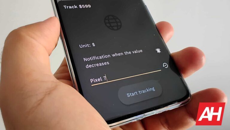
So, what exactly can it do? Well, let me give you an example. I decided to test it out by setting tracking to a price of a product. You can basically get it to track anything. For testing purposes, I chose the Pixel 7 on Amazon.
All you have to do is open up the app, and tap the ‘+’ button at the bottom. Then paste the link of a website the product is on, and highlight the text or number you want to track. In this case, it’s the price of a product.
The app will allow you to choose whether you want to be notified when the price increases, decreases, crosses a particular threshold, and so on. There are quite a few options to choose from here
There are a number of use cases for this app
You are not limited to prices, though. You can track pretty much anything, in theory, though based on the comments, the app doesn’t really work with anything, so… do take note of that.
The developer says you can use this app to track your Twitter follower number, for example, or finances and stocks. The same goes for YouTube subscribers and views, and so on. Basically anything textual or numerical you can think of.
Another great example is to track when products are in stock. Simply put a tag on the ‘Out of stock’ label on a product, and when that changes, the app will let you know.
The free version does have its limitations
Do note that the app seems to be free, but there are limitations. You can go ahead and get a monthly subscription, annual subscription, or lifetime license, if you want. The price is not low, but if do plan on using this very frequently, it may be worth it for you.
In any case, if you want to try out the app, the link is provided below, along with some official images.
Ever since DALL-E planted the seeds, there have been a ton of AI image generators sprouting across the internet. Now, there is a multitude of options for people to convert their text to images. This leads people to search for the best DALL-E alternatives across the internet.
If you’re looking for a different image generator, then you’re in luck. It’s not the hardest thing to find another generator that can give you great results. Here’s a list of the best alternatives to DALL-E. These will include some examples along with the prompts that were used to make them.
Let’s start off with a simple one. Craiyon is a bit of a weird entry to this list of DALL-E alternatives because it’s technically part of the DALL-E family. This is a watered-down and lower-powered version of DALL-E that the company introduced last year. It’s a generator that you can use at your leisure without making an account.
The results that it produces are good, but they won’t exactly fool the eye. While most AI images definitely have a tell, the images generated by Craiyon are very unpolished compared to its more-developed big brother. When you enter a prompt, you’ll get a wall of nine images generated. You’ll sometimes be able to pick out a few good ones. Craiyon is meant to be a free introduction to AI image generators.
You’re able to generate unlimited images for free. However, there are some paid tiers that offer you added perks. For $6/month, you’ll get results within 45 seconds, no ads, no watermark, and high priority. Also, your images remain private. At $24/month, you’ll get those features (images are delivered within 20 seconds, however), and you’ll have early access to new features.
MidJourney is one of the most popular AI image generators out there, and for good reason. It stands out from the other generators by being hosted on a Discord server. The images are generated in different channels. All you have to do is join the server, accept the standard agreements on the landing page, and go to one of the designated generation channels. You’ll put in the prompt followed by your text. Then, you’ll see your images being made. When it comes to alternatives to DALL-E, this is one of the best.
Midjourny, while its images contain the classic hallmarks of AI images, is more than capable of creating jaw-dropping images. You’ll get amazing results when it comes to human faces, but know that finer details like teeth might be a bit wonky. Each time you generate, you’ll get four variations. You can regenerate the prompt based on any of the images, download them, or upscale them to 4K.
There’s a free plan along with three paid tiers. For free, you’ll be able to generate up to 25 prompts. For $10/month ($96/year), you’ll have access to 200 prompts every month. For $30/month ($288/year), you’ll have access to unlimited prompts. Also, you’ll have access to 15 hours of fast generations. After that, you’ll have the standard speeds. Lastly, for $60/month ($576/year), you’ll have 30 hours of fast-speed processing and up to 12 concurrent jobs.
Subscription price: None- but donations are welcome
DreamUp AI has the unfortunate fate of sharing names with Deviant Art’s image generator. This is a standalone project, and it’s a solid offering. To access it, all you have to do is create an account and jump right into the action. The interface is easy to use. You’ll see the text field on the very top. Just type in your prompt and click the purple Submit button. You can also choose how many images you want generated per prompt.
DreamUp AI is a solid contender. It’s definitely better than something like Craiyon, but you’ll still get your fair share of uncanny faces and messed-up features. In any case, it handles the human anatomy well and that goes for animals and objects. The only thing is that DreamUp is not the best for creating hyper-realistic images. They all have a painted or CGI look to them.
Using DreamUp is completely free, but there’s the option to give donations to help the development of the project. You’re able to either pay a monthly fee or do a one-off payment. You can pay between $5/month and $75/month.
Stable Diffusion
Stable Diffusion is definitely one of the best DALL-E alternatives, and you’re able to use it for no charge. You don’t even need to create an account to get a taste of it. When you go to the Stable Diffusion page, you’ll just need to click on the Playground button up top. Then, you’ll be taken right to the creation section. It’s self-explanatory. Type in your prompt and click on the generate button. It typically takes less than 10 seconds to deliver your results.
Stable Diffusion is definitely a powerful generator. It’s up there with the likes of DALL-E and MidJourney. Each prompt gives you four pictures, and there are usually ones that stand out as amazing. One of Stable Diffusion’s strengths is in making realistic images. If you give it pretty simple prompts, it can make results that look almost indistinguishable from photos. Just know that you’re still liable to get wonky results as well.
Using Stable Diffusion is free. When you go to the site, you’re able to use it right away. Also, there aren’t any payment plans.
Dream stands out on this list because it’s not a site. Rather, it’s an app. When you enter the app, you’re greeted with the text field up top with the available art styles below. When you type in a prompt, you have to select a style for the image. After that, it will start making your images. The images usually pop up within 15 seconds.
Dream does an impressive job considering that it’s an app. It’s good enough to give the other generators a run for their money. There are several styles that you can choose from, and it does a great job with realistic images. The issues with hands and faces persist, but it’s not as bad with some of the lower-tier generators. This is a great option if you want a strong generator with your choice of styles.
You have unlimited prompts, but there are certain features that are blocked if you don’t subscribe. You’re confined to one image per prompt and there are several styles that you can’t use. If you want everything unlocked (four images per prompt, all styles, and more), you can pay $9.99/month ($89.99/year). If you want to pay only a one-time payment, you can pay $134.99.
There’s a new malware roaming free online right now. It hijacks people’s social media accounts, steals login credentials, and mines cryptocurrencies using people’s devices, reports TechRadar.
New malware exploits users’ YouTube and Facebook account
The info comes from researchers from Bitdefender’s Advanced Threat Control Team (ATC), which found a new strain of malware named S1deload Stealer. The malware tries to avoid being detected by antivirus programs by using DLL sideloading. In the second half of 2022, malicious users were able to infect hundreds of users.Bitdefender products detected more than 600 unique users infected with this malware between July and December 2022, Dávid Ács, a researcher from Bitdefender, stated.
The malware needs to be downloaded and run by the victims themselves. It was hidden in archives (.zip files) that allegedly had adult content. When the victims downloaded and run the “content”, they didn’t find what they were looking for but instead got their devices infected with an infostealer.
Here’s what this malware is capable of. First, it can download a headless Chrome browser that runs in the background. It opens YouTube vids and Facebook posts and rakes up views. It can also download and run an infostealer that decrypts login credentials saved in browsers, as well as session cookies.
When it comes to a Facebook account, it tries to analyze it. It looks for whether the account administrates any Facebook pages or groups, if it pays for ads, or if it’s linked to a business manager account. All in all, you can imagine this makes the account even more valuable.
And then it can go ahead and download, install, and run a cryptocurrency miner. It mines the BEAM cryptocurrency for hackers. By the way, the hacker can also use the stolen credentials to spam on social media and try to infect even more machines.
A more techy explanation of the malware’s actions can be found on Bleeping Computer’s article. The moral of the story: don’t download shady things from the internet.
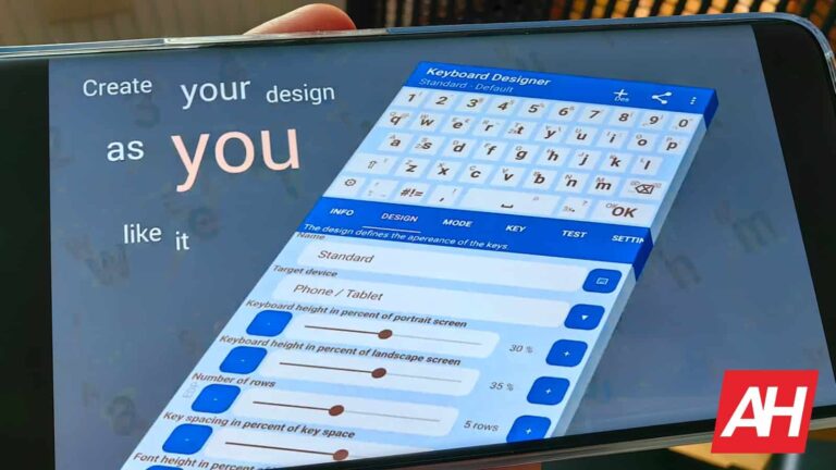
If you’ve never quite found the keyboard that you like, from a functionality standpoint, this app may help. This app basically allows you to design your own Android keyboard, and it’s called ‘Keyboard Designer’.
You can design your very own keyboard via this app, and much more than that
Now, this app is not all about the looks, it’s about the functionality too. In fact, that’s the bigger part of it. You can literally move around the keys as you please, and even assign specific tasks to specific keys.
Let me give you a couple of examples. You can set an action to launch when you swipe up over the space bar, or long press any button on the keyboard. You can also move the letter ‘a’, or whatever other letter, next to the space bar, if that’s what you wish. This is just a wild example, but this app does allow you to do pretty much anything.
It even allows you to increase the size of specific keys
Yes, you can also increase the size of some keys, to make them easier to press, and so on. The end product can look truly wild, if that’s what you wish. There are also various third-party designs that you can check out, as they’re available from within the app.
There are a ton of additional options that you can tap into. It would take an age to list them all, so if you’re interested, installing the app, and checking it out would be best.
This is an ideal solution if you’re tired of your current keyboard. You can truly spice things up. We’ve seen plenty of apps that offer different designs, and some that offer entirely different functionality, but never the app that allows you to create your own keyboard from scratch. Oh, and on top of that, customize it with various added functionality.
A link to its Google Play Store listing is included below, along with some official images.
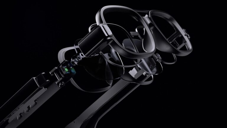
Augmented and virtual reality have been popular buzzwords in the tech industry for years now, with Meta striving to become a leader in both the software and hardware domains. Recently, Meta shared its latest hardware roadmap for AR and VR with its employees, revealing plans to launch full-fledged AR glasses in 2027 that people can wear all day, according to a report from The Verge.
These glasses will be able to project high-quality holograms of avatars onto the real world. Although many details about the glasses are yet to be disclosed, they have been in development for nearly eight years, and the company plans to start public testing by 2024.
While the AR glasses are not launching anytime soon, Meta is preparing to release several other AR and VR devices this year. These include the new Ray-Ban Stories, developed in partnership with Luxottica, and the Meta Quest 3, which will bring some massive improvements to comfort as the device is reportedly twice as thin while still retaining the same performance.
A look into the future
Next year, Meta plans to bring the VR experience to the masses with a VR headset called “Ventura,” which will supposedly be available at an attractive price. Moreover, the company also plans to launch the third generation of Ray-Ban Stories in 2025, which will offer advanced features such as real-time text translation, QR code scanning, and a “neural interface” that enables users to control the glasses through hand gestures and eventually type messages using a virtual keyboard. These advancements will take AR to the next level and offer users a more immersive experience.
It’s clear that Meta is striving to solidify its leadership in the industry with the launch of its AR glasses, but it’s not the only player. Apple is also developing its mixed reality headset, and while there’s not much information about it, reports suggest it may feature advanced hardware such as 4K Micro-OLED displays, motion-tracking cameras, and dedicated processing chips for AR and VR.