Samsung has launched a special edition Galaxy S23 in the US. The Galaxy S23 Tactical Edition is a unique phone made specifically for the United States Department of Defense (DOD) personnel. The company has also added the Galaxy XCover 6 Pro to the Tactical Edition portfolio.
Samsung launches new Tactical Edition Galaxy devices for DOD personnel
The Galaxy S23 and Galaxy Xcover 6 Pro Tactical Edition are mission-ready devices equipped with advanced capabilities based on military security requirements. These mobile devices are part of a comprehensive partner ecosystem that includes custom software and features. Samsung ships the devices with purpose-built drivers that support tactical radio and mission device protocols.
They let DOD personnel access drone feeds and laser rangefinder information while simultaneously offering conventional cellular capabilities, including LTE, CBRS (Citizens Broadband Radio Service), Bluetooth, and Wi-Fi. A stealth mode lets operators LTE and e-911 and mute all radio frequency broadcasting for completely off-grid communications. The Tactical Edition devices also offer secure tactical communication systems.
For on-device security, Samsung has equipped the devices with its defense-grade security platform Knox. Its Knox Dual Data at Rest (DualDAR) service is an NSA (National Security Agency) approved security service that provides dual-layer encryption to protect confidential data even when the device is powered off or in an unauthenticated state. It ensures the secure storage of sensitive information or safe use of the devices in mission-critical environments.
The Galaxy S23 and Galaxy Xcover 6 Pro Tactical Edition devices also come preloaded with special apps. Samsung names the Android Team Awareness Kit (ATAK) and the Battlefield Assisted Trauma Distributed Observation Kit (BATDOK). ATAK and BATDOK. The former helps improve the real-time situational awareness of operators through mapping, messaging, and geo-fencing. All team members can simultaneously see the necessary information on their screens.
The latter, meanwhile, helps collect and distribute real-time patient encounter information. It enables medics quickly obtain a patient’s treatment history and also monitors the vitals of patients. They can then convey the information forward for advanced care if needed. These apps come with an optimized interface along with support for the programmable side button on the Galaxy Xcover 6 Pro. The devices also seamlessly integrate with a range of peripherals.
Along with all these tailored customizations, the Galaxy S23 and Galaxy Xcover 6 Pro Tactical Edition also benefit from the devices’ existing set of security features and durability. The former has Gorilla Glass Victus+ protection and an Armor Aluminum frame. It includes a rugged military-grade case as well. The latter, meanwhile, has a MIL-STD-810H standard ruggedness. Both models boast an IP68 rating and night vision mode as well. Military personnel can also leverage Samsung DeX to quickly create a desktop experience without needing one.
The latest Tactical Edition devices will arrive later this summer
Samsung has collaborated with the DOD for special edition products for over a decade now. It has launched Tactical Edition versions of its latest Galaxy devices in the past as well. The Galaxy S20 Tactical Edition in 2020 was the last such device. The company has now come up with two more. It unveiled the Galaxy S23 and Galaxy Xcover 6 Pro Tactical Edition devices at the national convention for the United States Special Operations Forces (SOF Week 2023) last week. Samsung will release the devices later this summer.
Apple is already testing its M3 Pro-powered MacBook Pro, and it features some improvements. According to Bloomberg’s Mark Gurman, the Cupertino-based tech company is preparing to shock the tech community. One can also say that they are preparing to live up to the standard they have set for the performance of their MacBook Pro devices.
This is the case because ever since Apple ditched Intel processors, it’s been one performance improvement to the other. The launch of the M-series processor line has been a breakthrough for Apple fans and creatives. MacBooks powered with this processor series perform outstandingly well, and they keep getting better with every new generation.
Now, it is time for netizens to welcome a new entry into the Apple M-series processor line-up. Under consideration in this article will be the Pro entry in the coming processor series. What should Apple users expect from this processor and what device will it power?
Better performance comes with the M3 Pro-powered MacBook Pro
In a recent Power On newsletter from Mark Gurman the tipster pointed out the presence of an M3 Pro processor. This chip will succeed the current M2 Pro that is in use on the current 14-inch MacBook Pro. Certainly, netizens and Apple fans alike can expect some upgrades with this processor.
Details regarding this new processor are still a bit sparse, as it might not launch anytime soon. However, Mark Gurman confirmed from his sources that this processor is already in its testing phase. It’ll pack some upgrades in terms of performance and efficiency in comparison with the M2 Pro chip that is currently available.
The coming M3 Pro chip is to pack a higher memory limit that might take it to 36GB for power users. Currently, users can only get the M2-powered MacBook Pro with 16GB worth of memory capacity. But with the launch of the M3 Pro-powered MacBook Pro, Apple fans might be able to get it with more unified memory.
Coming over to its CPU and GPU cores, the M3 Pro-powered MacBook Pro will get some improvements. Currently, the available testing chips run on 12 CPU and 18 GPU cores, which is an improvement from the M2 Pro chip. Other M3 Pro chips might kick up the CPU and GPU cores, but the chip is made up of six high-performance cores.
These cores will take care of the intensive tasks that a user will run on the system. It also features six efficiency cores for tasks that do not require much power. These details prove that Apple is improving the performance of their MacBook Pro device. This device will likely launch by the end of this year or at the start of next year.
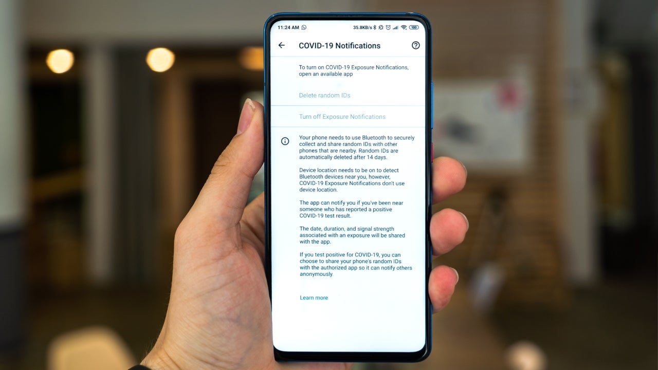
Effective May 11th, 2023, COVID-19 was no longer considered a Public Health Emergency in the U.S. As a result, the COVID-19 Exposure Notifications System (ENS) responsible for letting you know when you have most likely been in contact with someone who has tested positive, is being shut down in the majority of states.
The COVID-19 Exposure Notification System (ENS) revolutionized the way in which public health officials fought against the pandemic by making it possible for users to receive alerts on their smartphones once their device detected that it had been in close proximity to an individual who had recently tested positive and reported their status through the system. This allowed for those that were potentially exposed to take swift action and get tested.
This was possible largely thanks to the efforts of Apple and Google in the early days of the pandemic, both of which raced to develop a unified approach to exposure notifications. It was initially unveiled in April 2020, but it wasn’t until September of that same year that the feature was fully integrated into numerous Android and iOS devices through OS updates.
Once a feature used by a total of 28 states, as the pandemic restrictions loosened so did states’ response to implementing exposure notification solutions. Finally, as Apple, Google and the Association of Public Health Laboratories (APHL) discontinued their support and servers, so did the remaining states that were still making use of it.
Thanks to the utilization of the ENS, though, the expertise and know-how acquired will pave the way for a more efficient and effective public health system in the future. There is no longer a need to start from square one, since a solid foundation has already been established. To that, APHL Program Manager of National Server Operations, Emma Sudduth added:
The collaboration between private technology companies and public health in this endeavor made a far stronger solution. Learning from this experience and growing these established relationships will strengthen public health.
As we move forward and look to the future, it is important to remember the role that technology played in our every day lives during the pandemic. We often think of this being limited to video conferencing and how being connected through social media allowed us to stay active and productive. However, the use of technology for exposure alerts proves that when working together towards a common goal, incredible things can be created.
Mandiant, a cybersecurity enterprise, has released a fresh report revealing a new malware strain, named “PIPEDREAM,” being employed by Russian cybercriminals to target American energy firms, intending to exfiltrate sensitive information.
The report highlights that these cyber invaders are using an assortment of tactics to penetrate energy firms, such as spear-phishing campaigns, capitalizing on software security flaws, and employing social engineering strategies. They have managed to infiltrate various energy companies’ networks, enabling them to seize sensitive data such as customer details, proprietary information, and financial records.
The cybercriminals are reportedly tied to the Russian government, focusing on US energy companies to potentially disrupt the American energy industry. The stolen data could be used to conduct subsequent cyber-attacks against these firms, according to the report.
This information emerges amid escalating tensions between the US and Russia, with allegations from the US about Russian interference in the 2016 presidential election and Russia’s alleged hacking of numerous US government agencies.
The report underscores that American energy corporations are prime targets for cyber invasions. The vitality of these companies to the US economy and their role in energy production and distribution make them attractive targets. A successful cyber-attack could have considerable consequences for the US economy.
The findings emphasize the urgency for energy firms to bolster their defenses against cyber-attacks. Recommendations include the implementation of robust security measures like strong password policies, multi-factor authentication, and regular software updates. Additionally, educating employees about cyber threats and defensive measures is vital.
The findings serve as a stern warning to US energy corporations. They must amplify their defenses against cyber threats and stay informed about emerging threats.
PIPEDREAM Malware Strain: A Closer Look
PIPEDREAM is a modular malware capable of stealing various sensitive data types, including customer information, intellectual property, and financial data. It is typically delivered to its targets through phishing emails or by exploiting software vulnerabilities. Once installed on a system, PIPEDREAM can exfiltrate data and transmit it back to the cybercriminals. The malware is notably sophisticated and challenging to detect and eliminate.
Cybersecurity Measures for Energy Corporations
Here are some protective measures energy companies can adopt to shield themselves from cyber-attacks:
Adopt stringent security protocols, including robust passwords, multi-factor authentication, and timely software updates.
Educate personnel about cyber threats and protective measures.
Develop a contingency plan for responding to and recovering from a cyber-attack.
By adhering to these guidelines, energy companies can enhance their defense against cyber-attacks.
CISA has added a Ruckus vulnerability being abused by the AndoryuBot botnet to its catalog.
Along with six older vulnerabilities, the Cybersecurity and Infrastructure Agency (CISA) has added a vulnerability in multiple Ruckus wireless products to the Known Exploited Vulnerabilities Catalog. This means that Federal Civilian Executive Branch (FCEB) agencies need to remediate these vulnerabilities by June 2, 2023.
The Common Vulnerabilities and Exposures (CVE) database lists publicly disclosed computer security flaws. The Ruckus vulnerability is listed under CVE-2023-25717, which indicates that Ruckus Wireless Access Point software contains a vulnerability in its web services component. If the component is enabled on the access point, an attacker can perform cross-site request forgery (CSRF) or remote code execution (RCE). This vulnerability reportedly impacts Ruckus ZoneDirector, SmartZone, and Solo Aps with Ruckus Wireless Admin panels version 10.4 and older.
The Ruckus security bulletin about the vulnerability, issued on February 8, 2023 and edited on May 11, 2023, displays a long list of affected devices. Several of these devices have reached end-of-life (EoL) which means they may not get patched against this vulnerability. Users of supported devices can find download links and install instructions by following the links behind their specific product.
One malware operator that has been found to exploit vulnerable Ruckus devices is the relatively new botnet, AndoryuBot. Infected devices are used to propagate the botnet malware to other devices and are used in DDoS attacks. To avoid detection and to bypass firewalls, the botnet uses the SOCKS proxying protocol. SOCKS is an Internet protocol that exchanges network packets between a client and server through a proxy server. This protocol is often used because it allows traffic to bypass Internet filtering to access content which would otherwise be blocked, but it can also be used to circumvent blocklists and firewall rules.
Protection
To protect your devices against the AndoryuBot botnet which seems to thrive on this vulnerability, you should install the available patches and replace the legacy devices that have reached EoL.
Other measures to protect your devices from falling prey to botnets are:
Do not make your admin panels accessible from the internet if you can avoid it. If you can’t completely disable remote access, use very strict access policies.
Segregate your network so critical components are separated from vulnerable assets.
Apply active protection software and monitor network traffic.
The Malwarebytes web protection module blocks the download of the botnet malware:
Malwarebytes blocks 163.123.142.146
We don’t just report on vulnerabilities—we identify them, and prioritize action.
The Google Pixel 7a is the company’s latest smartphone. It got announced earlier this month, during Google I/O. We’ve already compared the Pixel 7a to several Pixel phones, and it’s time to do the same with yet another one. In this article, you’ll see the Google Pixel 7a vs Google Pixel 6comparison. Some of you may be thinking of switching from Google’s 2021 flagship to the Pixel 7a, or getting it instead of the Pixel 6. Is that a good idea? Well, let’s try to find out, shall we?
We’ll first list the spec sheets of both of these phones, before we get down to various different sections. We’ll compare their designs, displays, performance, battery life, cameras, and audio performance. There’s a lot to talk about here, they’re both similar and different at the same time, so… let’s get to it.
From the front, these two devices are quite similar. They both have that square-ish design that we’re used to by now, rather thin bezels, and a centered display camera hole. The bottom bezel is thicker than the rest on both phones. They do include flat displays, and a camera visor on the back. That camera visor is different in comparison, though. The Pixel 7a, it’s covered by metal, while Google used glass on the Pixel 6. That sure does make them look different enough.
Unlike on the Pixel 7, the Pixel 7a’s camera visor doesn’t physically connect to the side frame. One major difference on the back is the backplate. On the Pixel 7a, it’s made out of plastic, while glass covers the Pixel 6 backplate (Gorilla Glass Victus). Physical buttons sit on the right-hand side of both of these phones. Both phones are water and dust resistant, but the Pixel 6 offers a better rating. It’s IP68 certified, compared to IP67 certification on the Pixel 7a.
The Pixel 6 has a larger display than the Pixel 7a, and it’s larger overall. It’s taller, wider, and about the same thickness as the Pixel 7a. It does weigh a bit more, mainly due to the glass backplate, probably It weighs 207 grams, compared to 193.5 grams on the Pixel 7a. The in-hand feel is very similar between the two, though the Pixel 7a is smaller, and is definitely easier to use with one hand.
Google Pixel 7a vs Google Pixel 6: Display
The Pixel 7a features a 6.1-inch fullHD+ (2400 x 1080) OLED display. That display is flat, and it has a 90Hz refresh rate. We’re looking at a 20:9 display aspect ratio here, and that panel is protected by the Gorilla Glass 3. The Pixel 7a’s display has a PPI of 429. This display is noticeably smaller than the one on the Pixel 6.
Google Pixel 6 display
The Google Pixel 6 has a 6.4-inch fullHD+ (2400 x 1080) AMOLED display. This panel has a 90Hz refresh rate too, and it supports HDR10+ content. It’s flat, and has a 20:9 aspect ratio. We’re looking at a 411 PPI, while the Gorilla Glass Victus covers the display to protect it. The Pixel 6 has a slightly higher screen-to-body ratio.
Neither phone has immensely thin display bezels, but they’re still thin. The two displays are quite similar, actually. Neither gets up to the brightness levels of today’s top-of-the-line flagships, but most people will be happy with them. Both displays are vivid, have good viewing angles, and deep blacks. The touch response is also quite good on both displays. We don’t have a major complaint on either panel.
Google Pixel 7a vs Google Pixel 6: Performance
The Google Tensor G2 fuels the Pixel 7a, Google’s latest processor. The company also packed in 8GB of LPDDR5 RAM and UFS 3.1 flash storage. The Pixel 6, on the flip side, comes with the Google Tensor chip, along with 8GB of LPDDR5 RAM and UFS 3.1 flash storage. The Pixel 7a does have a more powerful SoC in comparison, while they’re on the same playing field when it comes to RAM and storage prowess.
Truth be said, both smartphones are more than fast enough for regular, everyday performance. They open apps quite fast, are great for jumping between them, and can also do more demanding tasks with ease. Well, everything except intensive gaming, that is. Graphically-intensive games are not running that great here, Qualcomm’s flagship SoCs are better equipped for such usage.
8GB of RAM is enough for both phones to run quite smoothly, though don’t expect them to keep many apps in the background for long. That won’t really affect the overall performance speed, but it’s worth noting nonetheless. We did not notice a notable difference in performance speed between the two, to be quite honest, they seem to be on the same playing field in that regard.
Google Pixel 7a vs Google Pixel 6: Battery
The Pixel 7a has a 4,385mAh battery on the inside. The Pixel 6, on the other hand, includes a 4,614mAh battery. That difference is not surprising considering that the Pixel 6 also has a notably larger display. The Pixel 7a battery life was questionable for us at first, lasting around 6 hours of screen-on-time, but it improved since then. We can now comfortably cross 7 hours of screen-on time, on average.
Something similar can be said for the Pixel 6, actually. Well, unless you’re driving around a lot, and using mobile data. In that case, the battery life is noticeably worse. It could be due to the modem included in the phone, or simply Google’s optimization, but it has been going on for quite some time for us with this device. For months. It’s definitely something worth noting if you’re spending most of your day on mobile data, and moving around a lot
When it comes to charging, well, the two devices are quite similar. You’ll get around 21W wired charging here, and the same goes for wireless charging. Do note that the charging slows down immensely once you cross the 50-percent mark, though. It’s definitely not as fast as many competing smartphones offer, and also, the charger is not included in the box. That goes for both smartphones.
Google Pixel 7a vs Google Pixel 6: Cameras
The Pixel 7a includes a 64-megapixel main camera, and a 13-megapixel ultrawide camera. Google decided to change both rear-facing cameras compared to the Pixel 6a and Pixel 7. The Pixel 6, on the other hand, features a 50-megapixel main camera, and a 12-megapixel ultrawide camera, which is a far more familiar setup when it comes to Pixel phones. So, how do they compare?
Google Pixel 7a cameras
Well, both smartphones do a great job, first and foremost. There are some notable differences, though, which are mainly visible in low light. You’ll notice that the Pixel 7a has a tendency to provide warmer images during nighttime, compared to the Pixel 6 (and other Pixel phones), which tends to lean towards cooler tones. The Pixel 6 also handles intense dynamic range situations better than the Pixel 7a, as the white balance ends up being better, and it manages to pull more details from the shadows.
Other than that, they’re basically on par when it comes to stills. They’re detailed and well-balanced both during the day and during nighttime. The Pixel 6 does a better job with video recording, though, as the stabilization tends to be better on the Pixel 6. Other than that, both do a good job overall.
Audio
You will find a set of stereo speakers on both of these phones. Those speakers are not that different in comparison, and they do a good job. They’re both loud and detailed enough, without being too sharp. They’re not amongst the best speakers we’ve tested, though, not at all.
Neither of the two phones has a 3.5mm headphone jack, however. You’ll either need to use the Type-C port at the bottom, or rely on a wireless Bluetooth connection in order to hook up your headphones.
Over the past few years, TikTok has been hard at work trying to introduce new features in an attempt to not only maintain its dominant position in the short-form video market but also to gain some market share in the search industry. Now, in line with these efforts, TikTok has introduced a new search widget for iPhone and Android users, making it easy to access the platform’s search functionalities.
This move aligns with a marketing campaign earlier this year in the UK, where the company advertised itself as a search engine aimed at catering to the changing patterns in online content discovery. This is because immersive experiences offered by platforms like TikTok and Instagram are now gaining more importance over traditional keyword-based searches.
Speaking on this shift, Google’s Senior Vice President, Prabhakar Raghavan, stated, “We keep learning, over and over again, that new internet users don’t have the expectations and the mindset that we have become accustomed to. These users don’t tend to type in keywords but rather look to discover content in new, more immersive ways. In our studies, almost 40% of young people, when looking for a place for lunch, don’t go to Google Maps or Search. They go to TikTok or Instagram.”
Therefore, to add the search widget, iOS users can long-press on the home screen, tap the “+” icon, search for TikTok, find the “Search” widget, and tap “Add Widget.” On the other hand, Android users can find the new widget by long-pressing on the home screen, tapping on Widgets, and searching for TikTok.
The increasing influence of TikTok
While the new search widget is a step in the right direction for TikTok to grow as a search platform, experts and lawmakers have raised their concerns about the company’s influence, especially in the UK, where many young adults are now considering TikTok as a news source. Moreover, recent reports of a former ByteDance employee claiming that the Chinese Communist Party keeps a watchful eye on the platform and uses it as a propaganda machine and the ongoing FBI investigation on TikTok spying on US journalists have added to the concerns of UK lawmakers.
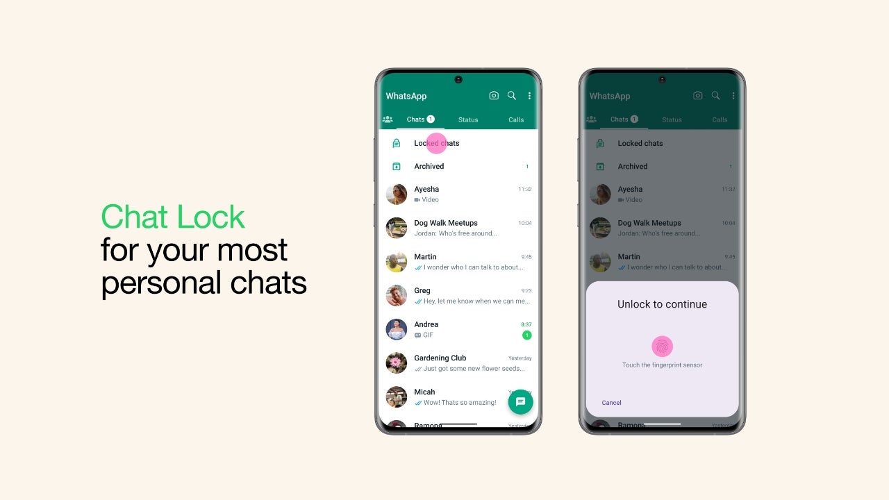
WhatsApp has announced a new feature called “Chat Lock” that adds an extra layer of privacy to its users’ most private chats. This feature allows users to lock a chat thread so that it can only be viewed after once again entering the device’s password or fingerprint.
WhatsApp touts this feature as a tool to make sure its users are able to keep their private talks private, even if the smartphone in question is passed around or someone is able to get into it without permission. This also works with notifications, making sure that any notifications from a locked chat does not show a preview of what is being said.
With WhatsApp Chat Lock, you can make sure that your private talks stay private even if someone gets into your device without your permission. Whether you share sensitive information, talk about personal things, or have private conversations, this new tool gives you the power to keep your privacy at its highest level.The announcement is accompanied by a video highlighting how the feature works and how it can be convenient in family settings where the phone could be borrowed several times by others to either take a photo or participate in a video chat. In it, you see the main character escape several scenarios where his private conversation could have been made public, only to be saved by the existence of this feature.
Locked chats can be accessed via the “Locked chats” folder, which can only be accessed by authenticating via the same method you use to unlock your phone. Locked chats will also be expanded in the coming months with new features such as extending the lock to companion devices and the ability to apply a different password to your locked chat folder than the one being used to unlock the device.
The latter helps in cases where you do want to give access to your phone to someone else by sharing your device pin, but still want to keep specific WhatsApp chats private. Currently, you are able to lock the entire WhatsApp application with your chosen authentication method, but this takes it one step further by targeting specific conversations. The feature is rolling out in the latest version of the app.
Based on the recent report from char49, it appears that there was a critical flaw in Ferrari’s subdomain, which led to an arbitrary file read vulnerability.
The vulnerability existed in the media.ferrari.com subdomain using a vulnerable WordPress plugin (W3 Total Cache) that could allow threat actors to read sensitive files on the server.
The W3 Total Cache plugin is used by millions of WordPress websites, increasing website performance. However, Ferrari had an outdated version of this plugin which threat actors could’ve exploited.
Technical Analysis
Ferrari was running on WordPress CMS(Content Management System), discovered by Inspecting elements with the Developer Tools offered by some browsers.
Hence, initial reconnaissance started with WPScan which revealed some interesting information like installed plugins on the website. This enumeration showed the W3 Total Cache version as 0.9.3, which was outdated. The latest version of this plugin was found to be v2.3.1.
Further research by the research team and some Google Dorking led to the discovery of CVE-2019-6715, in which W3 Total Cache Versions before v0.9.4 were vulnerable to unauthenticated arbitrary file read vulnerability.
The wp-config.php file must be located on the server to exploit this vulnerability. The path to this file depends on the operating system and the HTTP server type used.
The operating system was found and confirmed as Ubuntu 14.04.5 LTS by reading the /etc/issue file.
cURL request to /etc/issue file
The response shows the operating system used
The HTTP server was guessed as Apache and was confirmed by sending the request to the /etc/apache2/apache.conf which loaded the Apache configuration file.
Now, the virtual-host configuration file must be found, which is consistently named by the site owners. After several guessing, the virtual-host configuration file was guessed to be media.ferrari.com which was located at /etc/apache2/sites-enabled/media.ferrari.com
For finding the DocumentRoot path that servers the WordPress files, a cURL request is sent to the virtual-host configuration file.
cURL request to /etc/apache2/sites-enabled/media.ferrari.com
The response to this request revealed the DocumentRoot path.
With this gathered information, the wp-config.php file location is found as /home/web/mediaferrari/wp-config.php, which contains the database details and keys.
This extracted sensitive data, including DB name, DB password, DB host and other information.
DB details are revealed through unauthenticated arbitrary file read
It is recommended that all website owners be aware of securing their websites. They must be aware of vulnerable versions of WordPress plugins on their websites frequently and upgrade them to the latest versions to prevent malicious actors from exploiting them.
Even if you play games on PC, sometimes you just want to use gaming controllers instead of the trusty old keyboard and mouse combo, as they can provide the best experience. Sure, it might depend on the type of game you’re playing, or the game specifically.
But, chances are many players out there will have at least one game on PC that is simply better suited for gaming controllers. And if you’re playing on console, well then that’s almost always your best option. For mobile, it’s either a controller or touch controls. We’ve put together this list of some of the best gaming controllers out there. So you can do less digging and get to playing your favorite games. With that new controller no less.
There are a lot of options out there for this type of peripheral. So by narrowing things down to what we think are the best gaming controllers, it should save you some time.
Best Gaming Controllers
Below you’ll find a summary of all the controllers on this list. Along with the cost of each one and links that take you to the retailer.
Sony PS5 DualSense
Sony really knocked it out of the park with the DualSense controller. You’ll naturally get most of the benefits when using this with the PS5 itself. But it is also compatible with PC and mobile. So you can use it there too.
At the moment, there aren’t really any official third-party DualSense options like there are with the DualShock 4 for the PS4. So for PS5 purposes, this is really your only controller if you want the DualSense features.
As a controller for PC and mobile, it just feels great in the hands. And should have longer battery life than that of the DualShock 4. Even if only by a little bit. For use with PS5, it has the adaptive triggers, and the improved haptics. You just can’t beat it.
The new wireless controller for Xbox from Microsoft is essentially the same controller as before. But with a few minor upgrades. First, it feels lighter than the older ones. But it also comes with textured surfaces on the backs of the controller grips. So it should help prevent slipping from sweaty hands.
It also now has a share button for easy screenshot captures. It’s compatible with Windows 10 PCs, Xbox One, Xbox Series X|S, and mobile devices. And it comes in tons of colors. So you can more or less personalize it.
Razer’s new Wolverine V2 Pro is the ultimate controller from Razer for your PS5. It features the mecha-tactile action buttons, programmable buttons on the back and top, and HyperTriggers for that fast, mouse click feel when pulling triggers in games. Which are perfect for titles like Modern Warfare II.
There’s also an 8-way microswitch d-pad and removable thumbstick caps. And of course, it has Chroma lighting that you can control using the Chroma mobile app. This is designed for PS5 but it can also be used with PS4 and PC, as well as with mobile devices.
One of the big boys of the controller world is the Elite Series 2. Which gives you, the player, nearly full customization of the controller. Right down to the height of the thumbsticks and the weight of the controller itself. You can also swap the thumbsticks out, adjust trigger height, and it comes with textured grips for less slippage, as well as paddle buttons on the back for extra controls in your favorite high-stakes games.
There’s a lot of features on this one. So it’s naturally a little more expensive. But most people that have used it will tell you it’s worth it for the advantage you’ll have in games.
If you can’t comfortably use a traditional gamepad, then look to Microsoft’s Xbox Adaptive Controller to help you continue to play the games you love. The coolest thing about this controller is that it allows you to configure your game controls in a way that might work better for you layout-wise.
Basically you can use this controller to set something up that works for you. As it takes every single input and deconstructs them and gives them their own port on the back. So you can plug things and get a setup that’s more accessible.
This is another tournament-grade competitive controller that comes with a lot of extras. It comes from Nacon, who specializes in making these kinds of controllers that are focused on Esports. In fact we reviewed Nacon’s RIG Compact Pro for Xbox and PC, which we found to be a great option.
With the Revolution Unlimited Pro V3, you get extra buttons on both controller grips, as well as customizable thumbsticks, wireless and wired connection options, and more. The D-Pad can even be used as a 4-way or 8-way D-Pad depending on what you like.
The Razer Kishi V2 improves on everything that was great about the original controller. Though it does have to give some things up. For starters, the Kishi V2 now has a more rigid and sturdy bridge that your phone sits against. But this means that Razer had to give up the collapsible design of the original Kishi.
Still, the Kishi V2 gains much more than it loses. It now has an open design where parts of the controller that touch your phone are flat instead of enclosed. Which means it can be used with phones that have an off-center USB-C port, like the ROG Phone 6 Pro.
The Kishi V2 also now adds micro switches for some of the buttons which gives them more of a clicky tactile feel. And it offers two new programmable macro buttons which the original Kishi didn’t have. All around this a refined design of one of the best mobile controllers to ever hit the market.
When it comes to custom controller for the PS5, there are not that many options out there. But out of the ones that are, the HexGaming Rival is one worth checking out. It has a range of customizations you can make that will personalize the controller to your liking.
This includes mappable paddles, interchangeable thumbsticks, and my favorite part, the option for FastShot digital buttons on the L1/R1 and L2/R2 triggers. With these in place, the trigger press on the controller will feel more like a mouse click thanks to there being less travel time. Which is ideal for first-person and third-person shooters.
This option isn’t ideal for those that want the full press with the triggers. Especially if you want the adaptive trigger features that the DualSense was designed with. The HexGaming Rival is also quite spendy. That being said, we’ve used it in games like Call Of Duty: Vanguard, Battlefield 2042, and Outriders and have loved it. So if you’re ok with the price, there’s lots of customization to be done here. From functional adjustments to a personalized design. Making this one of the best game controllers.
Continuing with SCUF, if you also play on PC and Xbox, then you probably want to at least consider the Instinct Pro. It offers a lot of what you’ll get from other SCUF controllers, but with quite a few improvements. For example, it can store up to three different profiles on the onboard memory for a customized control setup for different games. And you can swap between them on the fly with a button right on the front.
It also has the customizable, adjustable triggers, back paddle buttons, a wide array of customization options for the design, wireless and wired connectivity options, plus instant triggers. The instant triggers are a real game changer as they can go from feeling like a regular trigger press to the quick and precise click of a mouse.
There’s also a high-performance grip on the back. SCUF isn’t playing around when it comes to its controllers. And you shouldn’t be either. Unless it’s when you’re actually playing games.
The SCUF Reflex is SCUF’s version of a customized DualSense controller. Like the HexGaming Rival, and like SCUF’s Instinct Pro for the Xbox and Windows, the SCUF Reflex has multiple paddle buttons on the back. The advantage you get with the Reflex over something like the Rival from HexGaming, is that the paddle buttons can be removed. So you can have them there when you want them. Or take them off when you don’t.
The Reflex also comes in three models. The Reflex, Reflex Pro, and Reflex FPS. The Reflex and Reflex Pro are mostly the same. They have the removable and mappable paddles, the adaptive triggers are still intact as is the advanced haptics. The difference is that the Pro model comes with the high performance grip.
The Reflex FPS on the other hand comes with SCUF’s famous instant triggers. The downside there is that they replace the adaptive triggers. So you don’t get that feature or the haptics as those have been completely removed as well.
While these are also fairly expensive controllers, they really do wonders for your gaming if you like having a more customized set of controls. The only issue right now is that they’re kind of hard to get as SCUF has to replenish stock.
This is definitely one of the best gaming controllers out there. If you can get a hold of one.